The Broken Promise of Design Systems

Design systems were supposed to solve the chaos. Instead, they often create more of it.
What looks like a clean, scalable solution on the surface quickly becomes a frustrating maze of tokens, buttons, and undocumented logic. Developers don’t know when to use what. Designers rely on visual memory instead of shared rules. Product teams lose trust in the system, defaulting back to one-off fixes. The promise of speed and consistency is broken.
Most design systems fail because they prioritize components over comprehension. They’re built like static libraries, not like living documentation. Teams end up scaling confusion instead of clarity.
We need a new approach. One that teaches, not just templatizes. One that serves the humans doing the building.
A Clarity-First Approach
This mindset shift starts by redefining what a design system is for. It’s not just a set of styles. It’s a communication framework that makes intent obvious across design, development, and product management.
When systems are built for clarity, everyone benefits:
- Designers stop arguing over button size and start designing with purpose
- Developers reduce friction, guesswork, and rework
- Teams ship faster with fewer inconsistencies and less risk
Clarity makes a system more than usable. It makes it trusted.
How to Build a Clarity-First System
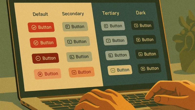
Visual hierarchy with purpose
- Clearly define roles like primary, secondary, and destructive
- Ensure contrast, size, and spacing reflect that hierarchy
Rationale in the open
- Don’t just show what exists. Explain why and when to use it
- Provide decision rules, not just design tokens
Examples over abstraction
- Use real content instead of lorem ipsum
- Show both best practices and common mistakes
Role clarity for handoffs
- Build for developers and PMs, not just other designers
- Annotate usage, state behavior, and interactive context
Onboarding built in
- Assume zero prior knowledge
- Embed walkthroughs, guides, and short videos that explain thinking, not just execution
Practical Steps for Any Team
If you’re starting out:
- Don’t just style components. Write out what each one is for
- Align your naming system with function, not just appearance
If you already have a system:
- Run a clarity audit. Where do people get confused
- Update documentation with real-life scenarios and edge cases
If you’re leading a team:
- Use the Danger Button Test: ask 5 people when to use it. If answers vary, you’ve got a gap
- Make system updates part of your weekly or monthly rituals
The Danger Button Test
Every system has one. A big red button labeled “Danger” or “Destructive.” But what does that really mean
Is it for deleting accounts? Canceling orders? Shutting down a process
If your team can’t answer that the same way, your system isn’t clear. It’s decorative. And that lack of clarity creates friction, delays, and mistakes. Especially in high-stakes industries like healthcare, logistics, or enterprise software.
Clarity-first systems don’t just look better. They make teams faster, products safer, and outcomes more predictable.
That’s what good design systems are for.