Aspen Was Quiet, But the Design Was Loud: One Month On

Back in April, MarketScale sent me to Aspen for something different. Not a content conference. Not a summit. Not a class.
But an immersive experience to get inspired, to learn, and to reconnect with design in a deeper way.
The trip was immersive, planned and invested in by the company, and came at the right time. Our platform is growing fast, evolving daily, and this was a chance to step back, recharge, and come back sharper.
And with “what’s next,” I mean right now, because we’re designing more than ever. Every part of our platform is getting better, and the work we’re doing for clients and creators demands that kind of clarity.
MarketScale didn’t send me to Aspen just for the views. They sent me because I needed space to think. To see design somewhere real not on a screen, not in a slide deck. To walk through the work of someone who actually built something that lasted.
The goal was simple: get inspired, recharge, learn something, and come back better. I wasn’t looking for a vacation. I was looking for clarity about typography, about architecture, about how design really shows up in the world.
Aspen just happened to be the place where it all came together.

Day One: Gondolas, Snow, and a Quiet Reset
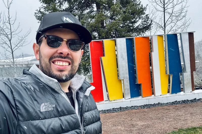
First stop: Aspen Mountain. We took the gondola up, looked out over the valley, and let the altitude and silence reset everything. Explored town a bit. Saw how even small details felt intentional. But the weather turned fast. So we headed back to the hotel, ordered food, and just slowed down. That dinner hit harder than expected. No distractions, no plans, just rest.

Day Two: From Art to Bauhaus
The morning started with a visit to the Aspen Art Museum. Quiet, minimal, and filled with light it set the tone. From there, I had the chance to have lunch at Ajax Tavern. It sits right at the base of the mountain where the skiers land after coming down. So it’s this great mix of raw mountain beauty and post-run energy. Cold Aspen beer, a warm french onion soup, and the kind of mountain-side vibe that makes you slow down and take it all in.
After lunch, I took the bus back toward the Aspen Institute for the real immersion. The afternoon was spent on a guided tour through the Aspen Institute campus walking the grounds, understanding the layout, and seeing how Bayer’s influence touched everything. The exhibit, the buildings, the way the place is structured all of it flowed together. The kind of tour that doesn’t just show you things, it rearranges how you see them.

Walking Into Bauhaus
We explored the Aspen Institute and the Meadows campus. You don’t need signs to tell you it’s Bauhaus. You feel it in the way everything is placed. The shapes. The colors. The rhythm. There’s no decoration here. No wasted space. Just decisions. Just structure. Just presence.
I wasn’t there to analyze. I just walked it. Let it hit. Let it rewire a few things. A bench tucked next to a sculpture. A window that frames the mountains like it was planned for that exact shot. Minimal, but not cold. Clean, but not empty.

The Exhibit
The exhibit was held at the Resnick Center for Herbert Bayer Studies, a space fully dedicated to the life and work of one of Bauhaus’ most influential figures. Just being in that building added weight to every piece on display.
I experienced the exhibit with just one other couple and our guide. It made the whole thing feel intimate and intentional. The couple turned out to be art connoisseurs seriously knowledgeable about Bauhaus design, Aspen’s history, and Herbert Bayer’s work. You could feel their respect for the space. They weren’t just looking they were connecting dots, asking thoughtful questions, filling in context. It shifted the whole experience. That kind of presence changes the room.

Bauhaus Typography at 100 wasn’t loud. It wasn’t packed. It wasn’t flashy. It was focused. Reduced. Tight.
The room itself felt like part of the exhibit bright, restrained, and precise. Each piece had space to breathe. You could actually hear yourself thinking, which made everything land harder.
There were posters, printed works, grid systems, letterform studies all the fundamentals stripped down to their essence. Nothing decorative. Everything essential.
One section focused on Herbert Bayer’s contributions, and it hit me just how far ahead of his time he really was. Type not just as letters, but as systems. As architecture. It was less about fonts and more about frameworks.

Every detail alignment, weight, spacing made you realize how typography, when done right, isn’t just visual. It’s structural. It guides behavior. It carries tone without saying a word.
It was the kind of exhibit that doesn’t overload you. It sharpens you. Makes you want to go back to your own work and clean it up. Make it say more by doing less.
A reminder that typography isn’t style it’s structure. It’s function. It’s communication.

What It Changed
A month later, I still think about those spaces. The silence. The structure. And how much it clarified what matters in design.
This wasn’t a sightseeing trip. It was a reset. Not a break from the work, but a shift in how I approach it.
Since Aspen, I’ve found myself cutting clutter faster. Asking better questions. Letting function lead. The clarity I found there didn’t fade when I got home — it got louder.
It’s showing up in how we think about branding, in the typography decisions we’re making, and in how we’re simplifying the way our platform communicates.
MarketScale is designing more, and designing smarter. Because the work keeps evolving. The trip didn’t just recharge me. It showed me how to aim sharper.
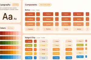
The MarketScale Studio UI/UX is a clear example. We’ve pulled Bauhaus principles into the structure: hierarchy, clarity, rhythm. We’re thinking in systems, not pages. Typography is more focused. Layouts are lighter. Every decision feels more honest.
And it’s not just for us, it’s for the creators and clients we serve every day.
— Raul R.